
A corporate website is more than a digital brochure, it’s often the first place your customers form an opinion about your company.
I’ve built and reviewed many business websites, and the difference between those that bring in leads and those that don’t usually comes down to a set of core features. These aren’t optional, they’re what visitors expect. Let me walk you through them.
Key Takeaways:
- Navigation should guide users clearly with menus, search, and CTAs.
- Mobile compatibility is mandatory for SEO and conversions.
- Clear content plus professional design builds trust and authority.
- Contact form, FAQ page, and interactive map make you accessible.
- A strong about page increase trust.
- SSL and privacy policies protect both you and your users.
- Analytics turn guesswork into smarter business decisions.
User-Friendly Navigation
Navigation is where most websites succeed or fail. If your visitors can’t find what they need within seconds, they leave. A clear menu, logical structure, and proper labeling make browsing easier.
Adding a search function (for a big site) and breadcrumbs reduces frustration. In my projects, I’ve seen bounce rates drop after businesses simplified their menus and placed clear call-to-action buttons in visible areas. Search engines also reward structured navigation because it helps crawlers understand your site.
Key elements to include:
- Menu with well-labeled categories and subcategories
- Search bar for quick content discovery
- Breadcrumbs for easier backtracking
- Buttons with strong calls to action on every important page
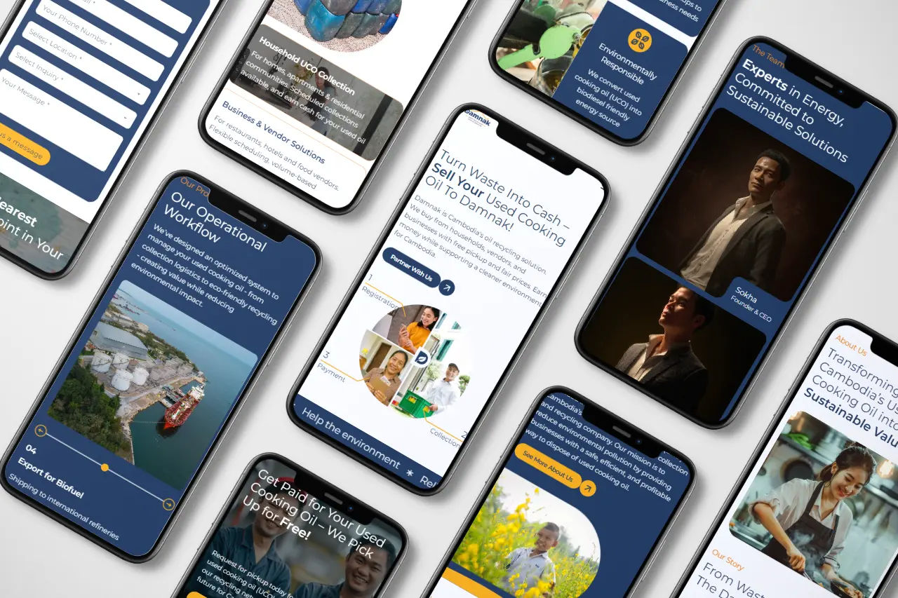
Responsive and Mobile-Friendly Design
Today, more than half of web traffic come from mobile. If your site isn’t responsive, you’re losing both visitors and rankings. Google uses mobile-first indexing, meaning your mobile version is what determines your SEO performance.
I’ve helped businesses fix their layouts to be fully responsive and watched conversions rise instantly. Responsive design also saves time and money because you don’t need separate versions for desktop and mobile.
What your design must cover:
- Mobile compatibility across all screen sizes
- One responsive layout instead of two separate sites
- Consistent branding and professional design everywhere
- Fast loading speed, critical for SEO optimization
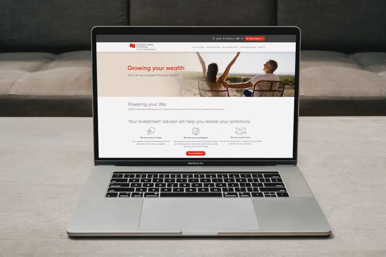
Clear and Compelling Content
Visitors come for information, not filler. You need content that explains who you are, what you offer, and why it matters in simple words. Avoid jargon and make it conversational.
Good content also builds trust: case studies, testimonials, and blog posts add proof that you deliver results. From my experience, companies that update their site regularly with fresh content keep visitors engaged longer.
If you’re targeting international markets, multilingual support ensures your message reaches everyone.
Content best practices:
- State your value clearly in the first seconds
- Use customer-focused language, not company jargon
- Add storytelling through case studies and testimonials
- Support global reach with multilingual content where needed
Contact and Support Information
Nothing kills trust faster than hidden contact details. A dedicated page with multiple ways to reach you makes your company look professional and reliable. I often check if a business list a contact form, phone, and email. If possible use your custom domain for the email to add trust.
A strong FAQ page also answers common questions before people need to call. For local companies, embedding an interactive map removes friction for visitors trying to find you. In my projects, businesses with clear contact options convert more leads because visitors feel supported.
What to include:
- Contact form, phone, and email details
- Clear business hours and response times
- FAQ section to save time for both sides
- Interactive map for physical locations
A Strong About Page
For a corporate website, the About page is one of the most important sections. Visitors want to know who is behind the company before they trust your services.
I notice that businesses with a clear about page usually convert better because people feel they’re dealing with real professionals, not a faceless brand.
What you should include:
- Team or leadership page with names, photos, and roles
- Company story or mission written in simple words
- Case studies or portfolio links to show what you have achieved
- Press mentions or certifications to boost credibility
This page is often where people decide if they will contact you. Make it personal, make it professional, and don’t be afraid to show the human side of your company.

Security and Privacy
No matter how good your design is, if users don’t feel safe, they won’t convert. Security proves your site takes responsibility for protecting data. Always install SSL so visitors see the padlock icon in their browser.
Be transparent with privacy policies and follow regulations like GDPR. I’ve worked with businesses where adding a clear policy instantly reduced user hesitation in submitting forms.
Key requirements:
- SSL certificate (lock icon in browser)
- Transparent privacy policy explaining data use
- Compliance with GDPR or local data rules
Analytics and Reporting
You can’t improve your website if you don’t track it. Analytics tools like Google Analytics or Umami show which pages get traffic, where people drop off, and what converts.
I regularly guide businesses through changes. Sometimes just moving a call-to-action button boosts conversions. Reporting also lets you measure marketing ROI, so you don’t waste budget on things that don’t work.
What to track:
- Traffic, bounce rates, and conversion rates
- Which call-to-action buttons convert best
- Blog posts or service pages driving the most visitors
- ROI from campaigns and advertising
By covering these features, you give users what they expect and show Google that your site deserves to rank.